Layout
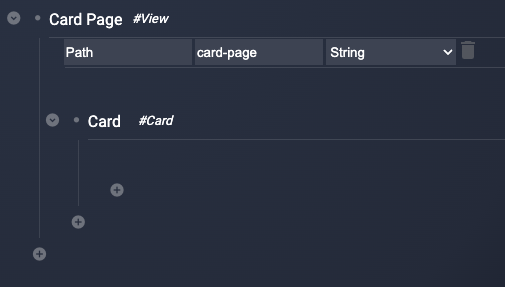
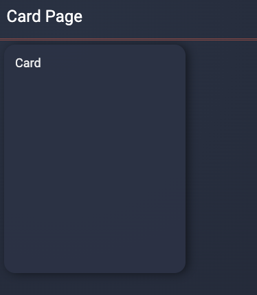
The main layout component is the Card which creates a box similar to a playing card with padding around the card. The name of the Card node will be displayed in the top left corner of the card, for example, here is a simple configuration with a View and Card
To adjust how components are positioned on the screen, the Group component is very useful, it can either create a group of components that stack in a column or in a row.
Below is an example of 8 cards not grouped, and then grouped into a row and then columns.
Component Configurations
Card
The Card component creates a group of child components and provides spacing and a border for the group.
Optional Fields
| Field | Description | Use |
|---|---|---|
| width | The width field is a number that scales the default width for different screen sizes | 1 = Default, 2 = Twice as big, etc. The actual width in pixels depends on the screen size |
| height | The height field is a number that scales the default height for different screen sizes | 1 = Default, 2 = Twice as big, etc. The actual width in pixels depends on the screen size |
| padding | Padding adjusts the space around the card | String with units in rem, 1rem is the default. rem = the default font size for the browser, so if the font size for your browser is set to 16px then 1rem = 16 pixels |
Group
The Group component creates a groups of child components and stacks them vertically or horizontally.
Required Fields
| Field | Description | Use |
|---|---|---|
| display | configures vertical or horizontal stacking | column or row |
| justify | How to justify child components | left, right, center |